Saturday, November 21, 2015

Recent digital art


A piece I did for a story I was writing.  All my art I do on SmithMicro's Manga Studios, but I decided to take this one into Photoshop after wards to change the hue, so it'd be colder. I still like both though. Always keep in mind what a difference color can make to your art, even the hue and shade can make a lot of difference. :)


Monday, November 9, 2015

Creating Comedic Manga with Chibis

I've done several actual Manga projects, but they take FOREVER. So, more often, more manga comics' heroes are little chibis. Chibis are easier to draw than actual Manga characters, and their extremely expressive. I've used them to tell whole stories, or just one page comedies. Just because their cute and small doesn't mean I won't make a sci-fi novel out of it and create an amazing battle between the space colonists beyond the outer rim and the Astron council's forces! lol.
You've seen my little comic where I was talking about Prismacolor manga pens- oh and if you haven't, you can find it here. This is an example of my one-page comedies; here is another.

 Sorry for not inking it, you can see it better if you enlarge it. For all manga, you need to have a plan in your haead of what you want and how you want to convey it. with only one page, you only have a little space, so you have to be able to convey your story in as few panels as possible.
Here I set it up in the first two, made the change in 3 and 4, and the punchline was five.
Both these boys want to ask this girl out, but they've been arguing over it so long that someone else beat them to it!
Check out Mark Crilley's book 'mastering manga' for more on panels and set ups.
In a one page comic, I usually change their circumstance drastically from page 1 and the end. In the prismacolor-pen comic, the kitty furry is safe in his fortress, at the end, he's running from death-by-snow-ball. when you deliver your punchline or 'reveal' your character's situations have just shifted. So should their expressions.
EXAGGERATION in action, words and expression is the FOUNDATION of comedy.

Sunday, November 8, 2015

Drawing manga clothes: shirts and sweaters

Here's a little drawing I did to demonstrate the differences between shirts and sweaters in drawing, and where you should place the wrinkles.
So with T-shirts, the fabric doesn't come up off of the body too much, because the fabric is thin. Wrinkles go in the standard waist, shoulder, bicep, and elbow if the sleeves are that long. Take some time to look at a few references, or just your own shirt to look at the direction of the wrinkles. Older girls will have some wrinkles under their chest.

For sweaters, turtle necks, Hoodies and the like, the fabric is thicker, so you need to be sure to draw it a little 'off' from the body to show that volume. because they're thicker, they tend to be heavier. This makes their wrinkles actually 'fall.' sweaters will have fewer wrinkles than tops made out of thiner material. Hope this helped!
For sweaters and other heavy materials, I suggest you look at how they fall, whether from a reference picture or something you're actually wearing( that's what I did for the top left xD ).

Saturday, November 7, 2015

Manga Markers: Prismacolor, Blick and Utrecht

More markers! I love markers; Okay, not crayola. Those were fine when I was little, not now. Probably not the right markers for you either.
My last post was on Tombow markers, the biggest collection of markers in my household( They aren't actually mine, if you read the previous post, their my mom's). Today I'm going to tell you the pros and cons of prismacolor markers.
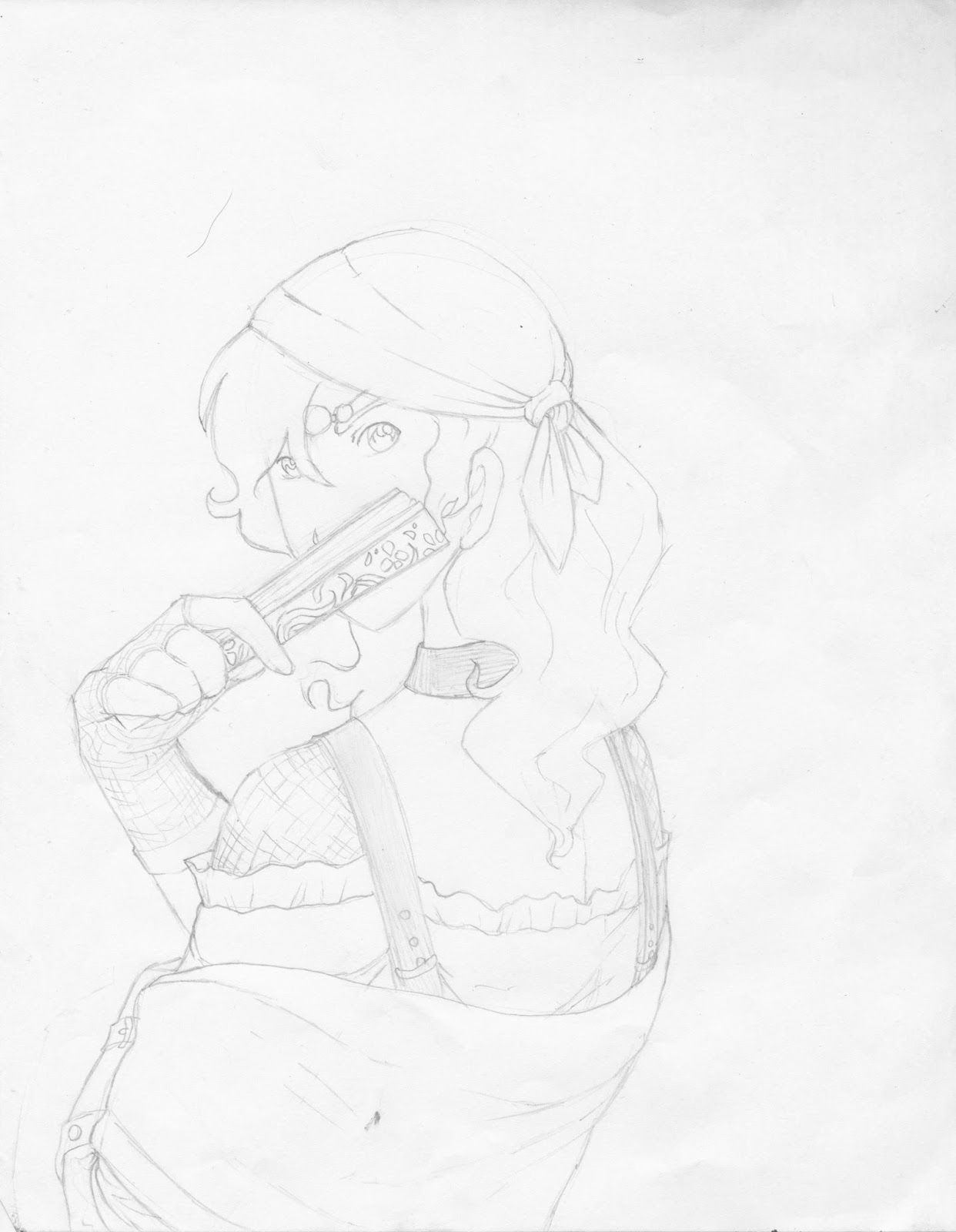
Here is a collection of dresses I did with my very limited set of prismacolor markers.

This was the first one; it had been a while since I had used my prismacolor manga markers, so I was just trying things out. Above in the left corner are my color tests, different combinations of my three green markers. Unlike the Tombows, the Prismacolor markers are a little more neutral in their color selections, which I love, because it does look better, especially on the page.

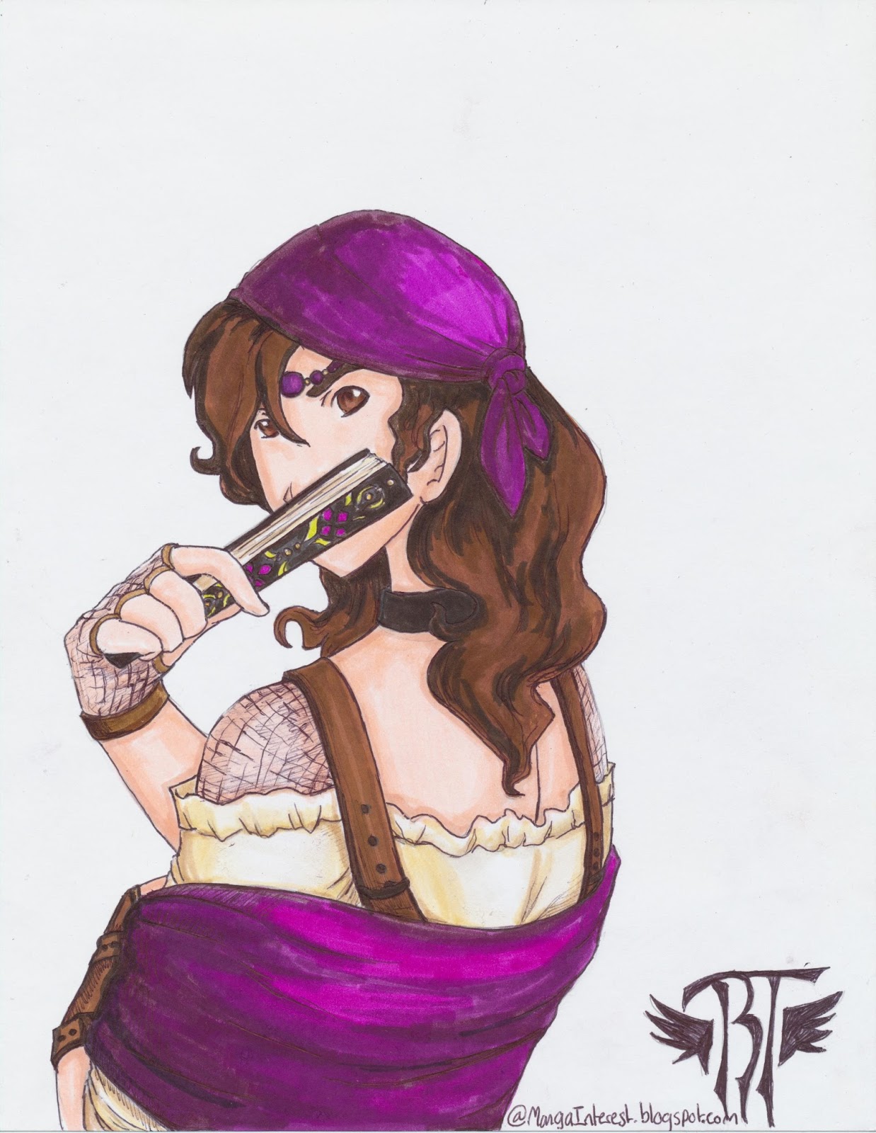
After I finished that one, I cut it out and added it to these. the green and blue ones are inked and the red is not. You would be surprised at what a difference that can make. It can save your drawing! 

PROS: between Utrecht, Blick and Prismacolor, Prismacolor markers blend the best. 
They're skin tones are EXCELLENT. I use brick beige and eggshell as basic skin colors.
They have a more neutral selection, which makes your drawing a little more appealing/more life like.
Their double end makes it easier to control your width.
 
 
CONS: expensive... but compared to copics, they're much cheaper.
Because of said expensiveness, it's hard for me to get a complete collection, so I filled up gaps and holes with a few blick markers and  Utrecht double ended markers. All three work very good together! Sadly they don't make the Utrecht markers anymore since Blick bought Utrecht. :'(

Here's a drawing I did with all three markers( blick, Utrecht and Prismacolor):

Some colors I didn't have, so I used a little bit of the tombows.

In case you're wondering( which you're probably not), I rate Utrecht as THE BEST, but their not sold anymore, and then Prismacolor and then Blick. Their colors aren't all that different from each other, except for the fact that the skin colors of prismacolor really are superior. 
What I love about Utrecht markers is that their brush tips are flexible, a complete life-saver, and they have lasted longer than the blicks.
The blick markers have good color selection, but their tips are stiff. :/

Friday, November 6, 2015

Manga Markers: Tombows

I sketched a gypsy girl yesterday and liked it so much I wanted to color it. The thing is, I'm not really great at it. xD
So I color rarely, but when I do, I use markers. I used my mothers tombow markers for this one.
First I started with a pre sketch; just trying to get down the idea I had in my brain.
 I wasn't quite sure what I wanted; at this stage I was just trying to put it down, heedless of proportion and perspective.

Then I trace what I wanted onto another paper and 'fixed it up.' I changed some of the clothes, but not the overall look. Then... I brought out the markers...

Ta-da! lol, I know, there is a bit of room for... okay, never mind, there's a lot of room for improvement. I changed any last-minute details and slathered it with color!
I really love the Tombow marker because of their brilliance. I like prismacolor more, but I only have a few of those and I've had them for three years and half of them are used up. :(
As for the Tombows, they dry quickly and and have an amazing pop-out-at-you appearance on the page. They have brush tips that make application fast and easy; if you're looking for the perfect starter manga marker, Tombow is it.
I still want to find a more efficient way to blend them though. I'll give you guys an update some time!