Wednesday, September 30, 2015

My art process on Manga Studio 4x

Remember this girly? 


Well, I'm going to show you how I inked and colored her in Manga Studios, with a layout and 12 panels so you can see how I did it.

The first panel is a clean page with the line art; from there I proceeded to splash on the color, not really caring where it landed as long as it was in the general area. On the fifth panel, I had all the color 'blobs' in place, but everything was extremely messy. In the sixth panel I erased extra color outside the lines with the eraser tool, easily done since I kept the skin, dress, hair and other main pasts on different layers. For the rest I added darker colors and blended the lights and darks together to give it a smoother look.

A few bits of advice:

Always keep your inking layer separate from your coloring layers; In Manga studios 4x, they have a nifty little thing called layer folders, which will keep you from mistakenly coloring on the ink layer.
Different paper colors will change the look of the colors on top. 
Blender tools are time savers!
Remember your light source( I kinda forgot mine)
Have at it and have fun. :)
That's a bit about how I use Manga Studio's coloring function.


 ... The beginning and the end...

Tuesday, September 29, 2015

Drawing Manga Children: Little girl


The charts skip a little, but I couldn't scan everything, sorry! have fun following along. :)

Monday, September 28, 2015

How to draw Manga Kids

So we all have that Manga how-to-draw book that only teaches how to draw super-unrealistic beautiful teens, right? But what about age differences or ethnicity? I don't. You?
I think Mark Crilley does an A+ job of trying to show different ages in his Mastering Manga books, and I've held a few other books that demonstrate how to draw the appropriate proportions.

little kid manga - Google Search: 
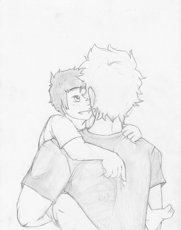
I DIDN'T DRAW THIS. Special thanks to whoever did. ;)
This is my example of an adorable manga kid, with child like proportions. I don't draw children that much either, but here are a few of the ones I have:


Children can be difficult to draw. As I was drawing the first, a manga girl with glasses, I had a little trouble trying to make her look as young as I wanted.


Here are a few points I think are important when drawing manga children:


1. Their heads need to be at LEAST as big as their hips or shoulders.
2. They don't need as much space between their hair and head; their heads are already to big.
3. Keep it simple, their hair, eyes, clothes- everything. I've come across the odd idiot or two who actually drew their kid with muscle definition. THEY DON'T HAVE MUSCLES TO DEFINE.
4. Children stay at least a little chubby until somewhere around the age eleven.
5. Big eyes. their ears, unlike adults and teens, should match their top to the eye's top and the ear lobe to the nose. REMEMBER: keep it simple.
6. hips and shoulders are the same width. At young ages, boys' and girls' bodies have little difference.

So, keep it simple, keep it round, keep it proportionate and keep it cute. ;) I'll see if I can do a step by step tutorial for manga kids later. I hope my hand writing is legible... lol.

Sunday, September 27, 2015

Age differences

So I like drawing people around my age; Young adults, older teens, and I don't hesitate to make them larger-than-life attractive. But when all I do is practice drawing that age group, then, in the end, that's all I can do.

Here are two pencil manga drawings I did with children: a young elementary student and a toddler in his mothers arms.

I need to practice drawing different ages so when the time comes to draw them I won't just be drawing miniature teens! The first picture is for Lion. I will ship it. To the end.

Saturday, September 26, 2015

Manga Studios: What I'm working on now

I'm still a newbie with digital art, but he are a few of my unfinished projects I started in Manga studios recently:


They're all unfinished Manga Studio projects, but I always like looking at where I began the picture to the finished piece. 1st is an astronaut falling into the atmosphere of Ganymede, 2nd is a girl at no name cafe, the 3rd and 4th are actually the same character with changed designs, and the 5th is my line art for a book cover I made a while back.

Friday, September 25, 2015

Imperfectionisim: Manga Sketches

We've all seen beautiful art, the finished master pieces and unbelievably good line art; But the sketches? Not really. It takes guts and realism to put out your imperfect 'idea' manga sketches. No one wants you to see the terrible mess their art began as, they want you to marvel at the completed project! But when we see those drawings our hearts sink; how is that level of expertise even possible?
Well I am here to tell you they started somewhere, and that somewhere was pretty ugly. Here are a few of my recent manga sketches- fast and furious pieces of art that I had a glimpse of in my mind, that I scribbled onto the paper before the image totally vanished from my mind. So of course, they're all messy.


 These are all idea sketches for a manga I'm making about Demons and Angels. Soon, they will be locked in battle! The forces of good and the forces of evil( ish) clash in an internal war of dominance; the loosing side will forever be cast out of Ethenil into outer darkness.
Archangel Joshua knows that the demons cannot be allowed to change the fate of the worlds, and is prepared for war- but he is not prepared in his heart. Joshua is in love with the sister of Lucifer, the dissenter's own blood.
Torn between his love and his loyalty, Joshua will lead the angels into battle, as the general of Ethenil's forces; the war can only end in bloodshed.
Joshua must kill the Demon general, the sister of Lucifer, Sabine; His lover.

.... Okay, as I said, they're all IDEA sketches. The point is to capture the motion, and E-motion, of the picture in your head as fast as possible. It's hardly ever proportionate or perfect, but it's motion in itself. Don't be afraid to let loose sometimes and doodle, or sketch a mess; a beautiful, terrifying, scribbly mess.

Thursday, September 24, 2015

Colored Pencil: The dreaded third attempt

So... You've heard that I haven't touched a colored pencil in two years, right? Weellll.... That's changing now. I have already drawn my third attempt! *over flowing with tears of accomplishment*
It's actually not much. But it's not a person, It's a dragon!

... You knew I'd sneak in a person somehow... I took the idea of my dragon from a picture in Neondragon's book Evolution on drawing dragons, which is AMAZING, by the way. It really doesn't matter if  you're into drawing dragons, or manga; if you're interested in drawing at all you should go check it out; it's probably in your local library!

My third attempt isn't half so bad, even if I didn't dare color in the background. I used prismacolor colored pencils and used a variety of browns and reds- but I then realized that the definition wasn't enough! The reds were too alike and there were no distinct lines. So I got a purple pencil and went over the lines; but there still wasn't much contrast. What color should I use now? Blue. I went over the whole dragon with indigo creating a MUCH better contrast and then making the dragon rider blue along with the dragon's tongue. 
I was very pleased with the turnout, and have decided maybe I can use colored pencils after all. 

Keeping focus: Improving your manga art


So you have this magnificent picture, and you color it. Or do some shading. Or you ink it in.
Once you're done, however, your eyes seem too wander across the page, and the picture has no real focus. Okay, so maybe you didn't even think of focusing the onlooker's view, or that your picture should have a center point of attention in the first place. That's fine, but I want to tell you why a center focus will improve your manga art and then demonstrate how I do it.

Here are two different scans of the same drawing. The first one has no shading, no color; nothing but lines. Not even line weight.
The second picture has been shaded and has a little splash of color. We get a much better feel of what's going on, the distance between characters, and we have something to focus on: The manga girl's ecstatic face.
With a center focus we( as 'readers') can see what is the most important object in the picture, and so we( as artists) can convey what we want to easily-er. <--- Yes that is a word, I just made it up.


So, How can we create this 'center point' and improve our manga art? I will tell you how I accomplish this.

Okay, so first you need to decide what you're trying to say with your art; and no, it's not like a sentence, it's not something you can write. It's more like a feeling. I wanted to portray joy in a young girl in a theme park. Here I imagine she's pulling her fiance away to space mountain. :P
So what I wanted the reader of my art to look at her face, look at her personality even.
1. I gave her sunglasses, a major pull of attention. Not the sunglasses themselves, but the contrast. I made her glasses and her eyes the darkest objects in the picture. Her eyes they are right in the middle of a completely white expanse. The center of attention will always be where your darkest darks and lightest lights touch- where the greatest contrast is.
2. When working with grays, adding one color will certainty draw attention to any part of a picture. The importance of the color is that it's one of a kind. But I also made a pin on her satchel red; I wanted to even out the attraction a bit.
3. Her eyes are the solely most detailed object in the picture( The point could be argued, but won't).

If you look back over the entire picture you can see that the manga girl is the most detailed, the castle, and her fiance being second and third. everything else in the background is melted together as a bunch of differently shaded shapes.

Recap:

WHY: A center point  influences what readers think about your art, it gives your manga art depth,  and conveys importance.

HOW: 1. lightest lights and darkest darks go together
            2. saturation in an unsaturated picture and vice versa
            3. Detail attracts attention.
Focusing the eye of your reader will definitely help your Manga art stand out against the rest! Comment below ways you keep your art reader's focus. :3

Pencils and shavings...

Good morning! It's been awhile, but I'm going to try to be consistent with posting this time. Over the past few days I've been trying to do a little more than just line art, which means I 'colored' some of my pictures. I call it coloring, but really all I do is shade in different shades of gray. This time though, I actually DO have a colored picture to show you guys, even if it's not well done, it's still actually colored.

 These first two I am very proud of, since I have little experience in shading and making things their correct value and at the same time keep the focus where I want it. The first, the one set in a library, is my favorite.
This is my second attempt with colored pencils in two years, and is considerably better than the first, though not as good as I wanted it too be. I guess you have to draw the line somewhere though. *sigh*
I will have to practice with colored pencils more...