Once you're done, however, your eyes seem too wander across the page, and the picture has no real focus. Okay, so maybe you didn't even think of focusing the onlooker's view, or that your picture should have a center point of attention in the first place. That's fine, but I want to tell you why a center focus will improve your manga art and then demonstrate how I do it.
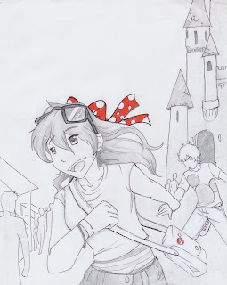
Here are two different scans of the same drawing. The first one has no shading, no color; nothing but lines. Not even line weight.
The second picture has been shaded and has a little splash of color. We get a much better feel of what's going on, the distance between characters, and we have something to focus on: The manga girl's ecstatic face.
With a center focus we( as 'readers') can see what is the most important object in the picture, and so we( as artists) can convey what we want to easily-er. <--- Yes that is a word, I just made it up.
So, How can we create this 'center point' and improve our manga art? I will tell you how I accomplish this.
Okay, so first you need to decide what you're trying to say with your art; and no, it's not like a sentence, it's not something you can write. It's more like a feeling. I wanted to portray joy in a young girl in a theme park. Here I imagine she's pulling her fiance away to space mountain. :P
So what I wanted the reader of my art to look at her face, look at her personality even.
1. I gave her sunglasses, a major pull of attention. Not the sunglasses themselves, but the contrast. I made her glasses and her eyes the darkest objects in the picture. Her eyes they are right in the middle of a completely white expanse. The center of attention will always be where your darkest darks and lightest lights touch- where the greatest contrast is.
2. When working with grays, adding one color will certainty draw attention to any part of a picture. The importance of the color is that it's one of a kind. But I also made a pin on her satchel red; I wanted to even out the attraction a bit.
3. Her eyes are the solely most detailed object in the picture( The point could be argued, but won't).
If you look back over the entire picture you can see that the manga girl is the most detailed, the castle, and her fiance being second and third. everything else in the background is melted together as a bunch of differently shaded shapes.
Recap:
WHY: A center point influences what readers think about your art, it gives your manga art depth, and conveys importance.
HOW: 1. lightest lights and darkest darks go together
2. saturation in an unsaturated picture and vice versa
3. Detail attracts attention.
Focusing the eye of your reader will definitely help your Manga art stand out against the rest! Comment below ways you keep your art reader's focus. :3


Love this post!! XD
ReplyDelete